Final Piece/s

Video

https://www.youtube.com/watch?v=agdOR-2A7Js

I am really happy with how my final video has turned out, despite the let down when it came to picking up the car I was originally going to film with. Overall, I had a lot of fun planning and filming this video, and enjoyed seeing my idea develop from just an idea in my head to a rounded, finished piece. I have learned a lot about storyboarding and time management when you’re under time pressure. I liked the added pressure of learning creative programs that I otherwise would hardly use, such as After Effects and Animate, as it gave me the chance to get to know them and learn new techniques across the Adobe Suite. One part I particularly liked was designing and animating my character into my video, as it is unique to my project. If I were to repeat this aspect of my final project I would definitely spend more time planning out shots that fit the storyline and I would use fewer tripod shots and more handheld camera angles. I would get more shots too, so I had more video clips to work with, this way I could be more creative and less linear when it comes to editing my video together, This is because I feel like I restricted myself due to not gathering any additional shots to accompany my work, I only gathered the shots I had already pre-planned. I would also act upon the research I carried out on shot lists and storyboards to create more in-depth plans to make adapting my project to a different vehicle easier than what it was. I have learnt during this project that it is okay to take your time with a video project and that I shouldn’t be afraid to ask for help if I need it, as I was only putting additional pressure on myself to get it done on my own, which was not possible. I have enjoyed producing a video in this style and would love to do something similar for a future project.

Poster/s

I made a good selection of poster designs, but these were the 3 I went with to be printed and displayed at the exhibition.

I am hugely proud of the posters I have created for this project as they allowed me to stretch my creative imagination and see my ideas of a campaign come to life. In print, these posters look really good (A2 size) and do their job effectively. They fit the mood and style of my campaign well and I had a lot of fun making them using Lightroom and Photoshop, and they came out looking really professional. If I were to repeat this project I would definitely spend far more time on my poster plans and designs, as I came up with quite a few ideas both during and after the project. I would also carry out more experimentation on some of my ideas to develop my work even further, which would allow me to stretch my imagination, and try new techniques, such as trying some of my graphic ideas in Photoshop, Illustrator and/or InDesign. I would also do far more sketching out of several ideas because this will allow me to plan even more thoroughly and give my self way more ideas to work with. I would have liked to try something new with my poster designs but I feel like I didn’t have the time due to issues with my video project, issues with my personal vehicle and time spent on a secondary client project. So for my next project, I would certainly work on giving my poster graphics more time that I did this time around.

Overall

This project has thrown a good selection of creative challenges my way, such as learning how to mask in After Effects and Using different features in Photoshop. I have thoroughly enjoyed being in control of my own project, and it has allowed me to show and improve my time management skills. It has also shown me that I am able to work under pressure and create professional looking work. If I were to repeat this project I would spend more time planning my pieces, and setting out my time management sheets, such as creating a Gantt chart. This would help me to always be busy creating work for my project and keep up with everything I need to do. I would try to not rely on other people so early on into my project because it did let me down, but this also taught me that sometimes it’s okay to cave in and ask someone for their help. I would spend far more time planning my outcomes and carrying out relevant research on my chosen topics, and I would ask my peers for their feedback at different stages of the project. If I had more time on this project I would definitely spend more time on my poster idea generation and designs as I feel like I could have been more creative with my campaign this way. I do feel like my time was spent well, especially as I had external issues out of my control, and had to spend my time on those things. But this has tested me to be able to work under more pressure to a deadline.

Feedback from Toyota UK:

My name is Matt and I am the Brand Awareness Manager here at Toyota GB, responsible for a lot of our UK brand advertising. Lasse in our customer team kindly passed on your enquiry to me.

Let me start by saying a big thank you for choosing the brilliant RAV4 Hybrid to include in your practical assignment – a fine choice if I may say so J

It’s always great to hear from someone keen to enter the advertising industry – and based on your excellent ad I’m certain you have a bright and rewarding future career ahead of you.

I really enjoyed the portrayal of the vehicle as a “companion” to the driver, which conveyed messages of safety, security and an emotional connection to the product. All of these things are difficult to achieve in a short ad slot and you have clearly put a lot of thought and hard work into it.

Toyota’s branding, visual identity and purpose statement has changed a little in recent years since the version you have used (but that’s fine – you can definitely take some creative license there!).

I’m also particularly pleased you resisted the temptation to include an ‘offer’ or an explicit ‘call-to-action’ in your ad (a personal bugbear of mine). TV and Video-on-demand advertising works best when deployed single-mindedly towards generating reach (maximising the number of unique people aware of your product) and frequency (optimising the number of times people see your ad so they feel and recall a connection to it). It is far more important that viewers derive a positive emotional connection with your product through your advertising than a pure sales message (in my opinion). This is particularly true in car advertising, given a lot of the people you will reach will not be in-market for a car yet (the average ownership period for new cars is about 3 years).

Overall a fantastic piece of work, and I wish you well both in this assignment and also your future career!

FMP Exhibition

At the end of the college year, we have the opportunity to display our work for the general public and visiting industries. To do this effectively we must show off our work in a contextually fitting style, and in a way that will get it noticed/sustain the viewer’s attention.

Physical Poster/s

Viewing context – Posters are most viewed when they are effectively and strategically placed. This means that posters are usually placed right in front of the viewer, for example on a billboard next to a busy road/highway, or in the middle of a shopping centre/high street. Posters are also used to quickly promote local events, as well as larger companies and their products/services. This is because they can be made into any size, any design and any style, making posters highly versatile.

My poster/s will be displayed mounted on a foam board and on a wall/board. this way they will take pride of place and be at eye-level.

Video/TV Advertisement

Viewing Context –  Videos are generally viewed on anything that has a screen, so on TV, social media and digital billboards. Videos are more effective than posters at showing off a product, service or their benefits, rather than a poster, as a poster is effectively just one frame from a video captured in photo form. Choosing which frame to use is the most important part.

My video will be displayed using a computer screen, which would allow for both sound and visuals. These will be placed under/in front of my poster/s because they need all need to be kept together for the campaign to make sense to the viewer.

Exhibition Plans

Here are the sketches I did planning out what my exhibition will hopefully look like. I spend some time working on how my projects would be viewed contextually so I could effectively display my work to the audience.

My Exhibition Display

Once I had all my posters printed and mounted, this is what they looked like up. I am really happy with how this turned out. I would have liked to have my final video and my bloopers feel displayed on separate laptops/monitors but my tutor decided to have out outcomes on a showreel together.


Midpoint Evaluation

At this point in the project, I am happy with the pace I have been working at and with what I have produced so far. I had to begin production earlier than I had originally thought as I was relying on a local company to sponsor me a vehicle to film with. As I have written in my time management plan this fell through right at the last minute, but because I was initially relying on this company, I had to come up with an idea and stick with it very early on. I slowly and minimally developed this idea to what it is now, which continues to change and develop during production, as I continue to learn and try new things.

Currently, I feel like my project is going well, and once I sourced a car and filming was completed it began to come together easily. After I filmed I was able to spend some time continuing my plans for the project and experiment with techniques. My posters have greeted me with a graphic design challenge, which will be interesting to tackle. My next objective for this project will be to design and create the typography to use across both my video and posters, as they are combined as an advertising campaign.

From this point, I will need to continue recording my progression and project processes while I’m working on both my video and poster/s. Doing this will allow me to learn by my mistakes and reflect on what I have achieved during this project, and will help me accelerate my learning in these advanced creative programs. I am aiming to have this finished by the end of April, but have the extra restraint of working outside of college of other projects. This will test me as I have to be able to separate the two projects for each other.

Poster Production

Sketches

Below are the sketches I drew out to plan my poster ideas. I did plan some more graphic focused posters, but these didn’t fit with my video campaign. These graphics give additional information about the individual vehicle that I am showing off, which may be more interesting to a viewer and potential customer. The general feel of my project is to avoid any ‘all to action’ techniques and use a more subtle form of gauging the viewer’s interest.

These designs are based on my shot plans, as I want to link my poster to my video to create a campaign that is recognisable. These plans each have their own small description underneath. I added a good amount of colour to my sketches to gain more depth and to either apply a colour theory or better understand what editing will need to be done to my images in post-production.

I will now develop my selected ideas into real posters ready for printing. I have chosen to go for one of my photo ideas rather than a digital graphic design task, as I don’t feel like I have the time to create something with so much detail. Though if I do get the time I would love to be able to develop a few of my ideas in an alternative way,  either through photography or graphics, even during my personal time once this project has finished.

I made some mockups of the graphic posters I planned. Although they didn’t turn out the way I wanted them to, they still illustrated the idea of ‘no half measures’, Toyota’s newest campaign. To do this idea I played with the word ‘measures. but using a tape measure and a measuring jug. The toy I used is a miniature replica of the Toyota C-HR, which fit with my ideas nicely, although this would be a graphics project so I would be able to change it to the RAV4 I was using.

Poster 1

This is the first image I will be working with to create a poster with to accompany my video campaign. I chose this one first as it followed the rule of thirds and a fair amount of negative space that I could use for typography and the logos I need to add extra branding to the poster.

poster 0

My first job was to edit and correct the image ready for the typography and logos to be overlaid. I did this little job in Adobe Lightroom CC. This included cropping and levelling, and some exposure and contrast adjustments. I also edited out the lens flare/s that came from the car’s lights.

poster 1

I then put the image into photoshop to further edit a few bits. This included the digital billboard in the top right-hand corner, and the one-way sign,  which both became distractions for the viewer. Although the billboard was hardly visible due to the way I cropped it in photoshop, I still wanted it gone as it was an eyesore and by covering it up it became neutral and was hardly noticeable in the image. I had already edited the sign in my video clips so it would be more fluid through the whole campaign.

poster 2.PNG

I then used a soft large brush to create a very light pink layer to match the colour of the ground. I then turned the opacity of this layer right down to create what you see below. This made the ground look softer and allows any text overlay to be seen more clearly by the viewer. By doing this, it made the person in the scene stand out against the background.

4e9d0da758614af5a7a61cbe097afdbf

I carried out additional research both on general car posters and Toyota posters. This helped me to take techniques from existing brand characteristics and apply the designs to my own posters.

422f9796cf0bad2260f5a7c7110b0c25.jpg

I also had a look at slogans that Toyota had used in advertisements for the RAV4 and C-HR Hybrids. I may also look at advertisements for Toyota’s other cars, such as the Yaris, Prius and the new Corolla.

I chose the same font as I used in my video, which had a simplistic style that fit the vehicle I am advertising. I also had to choose a ‘slogan’ for my poster that was informative but not too long or wordy. I chose a 3 step slogan, which gave the viewer a better idea of the car I was using, such as the fact it is a ‘self-charging hybrid’.

000bd3276341711541eaeade0f9e4ffc.png

I am happy with how this turned out, although I feel like I could have done better during planning and research of existing poster advertisements.

After this poster was finished, I decided to mess around with a few other designs so I had a good collection to chose from.

Poster 2

I used a different image this time, which had more negative space than the last one. I ran it through Adobe Lightroom to correct and edit the image before I  began shaping it into a poster using typography.

poster 3.PNG

I decided to take a more minimalist approach to make this poster, as I feel like my first design was far too clunky and messy. This was definitely the favourite of my two designs here, as I kept powering through making the posters and didn’t leave the time to write about how I did it. Like this one due to the anticipation that the negative space and colours create, the purples and blacks in the image completely contrasts the white car in the background. I also made for better use of the bright white digital billboard that was invading the background of my whole shoot, by including a Toyota logo here, although in a later edit I removed this, as it didn’t look quite right from a distance.

This is my final design, that I have chosen to have printed. I am really happy with how this has turned out and love the overall design and feel of the poster. I added the large faded Toyota logo at the bottom of the poster to fill the negative space in the image, which worked really well. It also creates a more visual link to the brand and slogan that just using a small logo in the bottom corner.

FMP poster 2

Blooper Reel

I made a quick bloopers video to build my skills and knowledge of both After Effects and Premiere Pro. This allowed me to experiment in these programs while keeping relevant to my project. To do this I took all the clips of times things didn’t go quite right and mashed them all together into a neat and comedic style short video. This gave me the opportunity to play around with the captions tool in Premiere, which Was easy to figure out and worked really effectively in the style of video I chose to pursue.

7a7373b8e69cf5b9f3519d9f08c685b8.jpg

End Credits

I made scrolling end titles in After Effects to put on the end of my blooper video. This was easily achieved through simple motion keyframing. This worked well to give credits during the bloopers because I won’t be able to add them to my final piece.

076bbe4b3ddbea40c9ae4683da613bb6.png

The final product (Bloopers)

I am really happy with how this turned out in the end. It has great comedic value and allowed me to experiment with new techniques and methods in premiere pro. I will submit this video and display it alongside my final advertising pieces as it shows a more lighthearted side to producing projects like this one.

Essay – Genres in Automotive Advertising

Due to my long-running interest in cars and advertising, this is the focus of my Final Project. In the advertising of cars, the company has to appeal to a combination of a wide audience and a specialised, funnelled audience. All advertisements fall in different genres and/or categories, eg series, dramatic or humorous. The majority of vehicle advertisements fit into different categories based on the vehicle brand. For examples, Volvo is the ‘definition’ of safety and their video ads reflect this by demonstrating new technologies and designs for accident or injury prevention, pioneering the 3-point seatbelt in 1959 (ArnoldClark Newsroom, 2019). Other companies may stand for different morals or take a different approach to advertising altogether.

It is natural for humans to classify and group things such as video games and movies, or even objects by shape, colour and size. This is instilled and demonstrated even in early life, such as in toddlers, and all for a good reason. By assigning objects to a group, it builds natural pathways needed to build on logical and mathematical skills for the future (Madigan, 2019). The word ‘trope’ is used to describe types of figurative speech, themes, imagery and plot elements (Literary Terms, 2019). Genres are categories or styles of story, mood or setting used in films, books, TV shows and even music. By the end of the silent movie period, many film genres had already been determined (UKEssays.com, 2019), and since then several others have come around, and some movies are now considered as ‘hybrid genres’, which is when it falls under more than one genre. Genres allow an audience to select films and TV shows that they may relate to, or quickly decide what interests them. In TV genres may be more along the lines of documentary, drama, soap operas and comedy (Bbc.co.uk, 2019).

The earliest films came around in the 1870s, but genres have only been used to classify film genres since the 1950s (Filmsite.org, 2019). TV advertisements have been around for 75 years (Quartz, 2019), this type of video advertising is becoming more prominent in our everyday modern lives, and can highly influence a buyers decision-making by showing off the product in its best light. Car advertisements started rolling out on July 30th 1898, showing off very early renditions of motorized carriages (Borroz et al., 2019), while Britan’s first TV vehicle advertisement aired in 1969 (Roderick et al., 2019). These specific advertisements do also fall into their own genres and sub-genres.

Automotive advertising is the biggest category in advertising, spending a massive $50.8 Billion in 2016 (Adage.com, 2019), including both automakers and tyre makers. This advertising includes several advertising media, such as graphics and video, which can all be fit into genres, sub-genres and hybrid genres. For example, Volvo is known primarily for pioneering modern safety systems, such as the 3-point seatbelt, Tesla is known for both innovation and futuristic design, and Vauxhall is known for family transport and reliability. These brands are each advertised differently, as they appeal to different audiences. Most advertisements that are shown on TV are designed to fit with the car, so if the car is sporty, say a BMW, the advert will be fast-paced and upbeat, while a family car may be shown off in a slower and easy-to-follow way, most likely a story of some kind. Vauxhall’s advertisements cover both upbeat for their Corsa, and slow story based advertisements for their Zafira. More recently, Vauxhall has had a heavy focus on being ‘ready for anything’ and claim that their new Grandland X ‘Keeps calm and carries on’ in any situation, is a contextual reference for ‘Keep Calm and Carry On’, which was a poster produced by the British government in 1939, to prepare citizens for World War 2 (Keepcalmandcarryon.com, 2019).

Tesla does not advertise in any conventional style, as the CEO, Elon Musk, has said in a previous interview that ‘If somebody gets the car and they love it […] they’re gonna talk.’ and that ‘we’re not spending money on advertisements or endorsements’ (Brownlee, 2019). This approach to advertising products can result in a company swimming or sinking, as has been further demonstrated by Tesla, who has struggled to turn over a profit for at least 2 years before 2018 (Ft.com, 2019). This shows us that this approach to selling products can impose implications on the sales they make, and could mean that their company takes a while to take off and appeal to a consumer. Tesla is definitely pioneering the future of automobile manufacturing and consumption by changing the way that we order and care for our vehicles, but without advertising and word of mouth, there may not be a consumer group interested in their products, including electric cars, power walls and solar panels.

At the opposite end of the spectrum, Ford Motor Company spent $2.5 Billion on advertising in 2017 (Neil Patel, 2019). The American automobile company design and manufacture cars and vans that appeal to a wide audience, including families, racers and tradespeople. Just like in films and TV shows, genres include certain characteristics. For example, the horror genre involves dark settings and spooky creatures, whereas a children’s genre may be colourful and upbeat.Car advertisements may use the same symbols to illustrate the genre they fit into, while not ever fitting to the exact genre characteristics. Vehicle advertisements have their own genres that are more likely to fit their target audiences, such as family, upper class, futurism/new technology and safety.

This is an area that will require far more advanced research, as there is minimal information in this field. While genres are important to us, we are able to break the mould and create general exceptions in their characteristics and symbols. My personal ambitions make this topic even more interesting to me, as I want to be able to create my own vehicle advertisements. Genres in film, tv, books and music are so heavily embedded in society compared to advertising genres, which is still relatively new to us, which opens the door for new research and theories surrounding this topic. We are able to see characteristics to apply genres to a media, which makes it easier to apply to advertisements and other unlikely media.

Bibliography

Adage.com. (2019). World’s Largest Advertisers: Spending is Growing (and Surging in China). [online] Available at: https://adage.com/article/cmo-strategy/world-s-largest-advertisers-2017/311484 [Accessed 19 Apr. 2019].

ArnoldClark Newsroom. (2019). Why Volvo gave away the patent for their most important invention. [online] Available at: https://www.arnoldclark.com/newsroom/265-why-volvo-gave-away-the-patent-for-their-most-important-invention [Accessed 8 Apr. 2019].

Bbc.co.uk. (2019). BBC iPlayer. [online] Available at: https://www.bbc.co.uk/iplayer [Accessed 18 Apr. 2019].

Borroz, T., Borroz, T., Barrett, B., Molteni, M., Valdez, A., Watercutter, A., Greenberg, A., Barber, G. and Niiler, E. (2019). July 30, 1898: Car Ads Get Rolling. [online] WIRED. Available at: https://www.wired.com/2009/07/dayintech-0730/ [Accessed 17 Apr. 2019].

Brownlee, M. (2019). Talking Tech with Elon Musk!. [online] YouTube. Available at: https://www.youtube.com/watch?v=MevKTPN4ozw [Accessed 18 Apr. 2019].

Filmsite.org. (2019). Film Genres. [online] Available at: https://www.filmsite.org/filmgenres.html [Accessed 17 Apr. 2019].

Ft.com. (2019). Tesla ends cash burn with first profit in 2 years | Financial Times. [online] Available at: https://www.ft.com/content/8fdc9b96-d7a9-11e8-a854-33d6f82e62f8 [Accessed 18 Apr. 2019].

Keepcalmandcarryon.com. (2019). History – Keep Calm and Carry On Poster. [online] Available at: https://www.keepcalmandcarryon.com/history/ [Accessed 19 Apr. 2019].

Literary Terms. (2019). Trope: Definition and Examples | LiteraryTerms.net. [online] Available at: https://literaryterms.net/trope/ [Accessed 8 Apr. 2019].

Madigan, J. (2019). Why Do We Love Genres So Much?. [online] The Psychology of Video Games. Available at: https://www.psychologyofgames.com/2010/02/why-do-we-love-genres-so-much/ [Accessed 8 Apr. 2019].

Neil Patel. (2019). Which U.S. brands Are Spending the Most on Advertising?. [online] Available at: https://neilpatel.com/blog/top-ad-spenders/ [Accessed 19 Apr. 2019].

Quartz. (2019). Watch: The first TV commercial, which aired 75 years ago today. [online] Available at: https://qz.com/721431/watch-the-first-tv-commercial-which-aired-75-years-ago-today/ [Accessed 17 Apr. 2019].

Roderick, L., Chahal, M., Chahal, M., Tesseras, L., Ratcliff, C., Woollen, P., Woollen, P., Woollen, P., Woollen, P., Woollen, P., Woollen, P., Woollen, P., Woollen, P., Ritson, M., Reporters, M., Fleming, M., Rogers, C., Joy, S., Joy, S., Joy, S., Joy, S., Joy, S. and Joy, S. (2019). TV ads at 60: A history – Marketing Week. [online] Marketing Week. Available at: https://www.marketingweek.com/2015/09/21/tv-ads-at-60-a-history/ [Accessed 17 Apr. 2019].

UKEssays.com. (2019). The Function Of Genre In Film. [online] Available at: https://www.ukessays.com/essays/film-studies/the-function-of-genre-in-film-film-studies-essay.php [Accessed 8 Apr. 2019].


Video Production

Final Plans

Below is my final shot list. I made this to illustrate my final ideas and plans into a ‘checklist’ to be used during filming to make sure I gather all the shots I need. I used the research that I had undertaken along with my research on storyboards to create a highly effective shot list, that is universally understandable by different people during production.

The next few images are that of my final storyboards. I am happy with the look and feel of these plans, as they look really professional, while still very simple. I have even more plans and sketches in my folder that will be submitted with the rest of my work. these sketches and plans aren’t as neat as these but do show my thought patterns.

It was suggested to me that I look at, and try to, redesign my storyboards from a different angle, such as birds-eye view. This allows for a deeper understanding for the camera crews and will help them to frame and compose the shots exactly how the director intended. it also helps to plan what will be going on ‘behind-the-scenes’ and out of the view of the camera.

My story idea takes the idea of how quiet electric cars are. I took the idea of someone being followed by an electric car being completely oblivious about what’s happening behind him. This is because of the car not making any/minimal sound. To help communicate this to my audience, I have encouraged my actor to act with added confusion when he notices the car behind him and will edit playing with the sound and music track I have chosen. I chose this song as it has a playful beat and the lyrics speak about how the singer wants the listener, which could be applied to my car and character duo. I am also going to be designing and creating a small animated character for the cars internal infotainment screen, which will give my audience an idea of how/why the car is managing to seemingly drive itself to follow behind the person.

One-Way Sign Coverings

There isn’t much in the way of editing other than the general cutting clips and editing the sound. For the first ‘special effects’ type editing work I needed to edit out the one-way signs in the shots. I designed a few different ways to do this with all involved covering the signs. I ultimately chose a design that allowed for additional advertising for the vehicle I used, a Toyota RAV4 Hybrid.

I then put my chosen idea into photoshop to prepare it to be overlaid on my video project. To do this I sourced the Toyota logo from online and overlaid it on a blue background. I started overlaying these on the signs I adjusted the blue to be a little darker so it didn’t stand out so much. I did this in the standard dimensions of a one-way sign, which had to later be adjusted.

photoshop.PNG

I scaled and fit the sign cover over the sign which made a good snug fit once I was finished with it. This design worked well to cover the signs and didn’t look too obvious to the viewer which is what I wanted. this also added for extra brand advertising in the scene.

prem 1.PNG

Sign and Head Masking

I used THIS video as a reference to masking in my own project. This helped me to better understand after effects and how it works, as I had struggled to figure it out on my own. Bty Masking this way it still allowed for freedom of movement. Once I put this into my premiere project, I’m realised that I’m not happy with the sign that I had to mask. To me, it seems to bright in the shot compared to the others (see above), but it might still work as the people I asked about it said that they didn’t really notice this until I pointed it out. This is something that I may come back to later on.

31602ce82e72a91133515840f0288a98.jpg

First Cut

This is what the premiere file looked like before I rendered out the first cut.

first cut.PNG

Overall I’m really happy with the progress that I’m making with this project. This first cut took me a few days to fully cut down and edit due to the special effects it required, and this was the finishing product. I will be designing a small emoticon character to animate and incorporate into my final piece, like this: >_< This character will add extra personality to my video and its storyline. This animation will be a challenge for me personally as I haven’t done very much animation on my own. This cut looks good and works well with the music I chose, but there are a select few clips that are a little too long, but I didn’t want to spend all my time making my first cut absolutely perfect, especially since I still had a lot of time to spend on this project.

Peer Review: 

Fluidity – The shot where you have the person taking out the earphone you could possibly add a shot of the actor walking into frame and around the car. This will make the actions of the person more fluid. Ending Sequence – I’d say that you should have the end titles as black text on a white background as it will be more eye-catching than white text on a black background. The music track you have chosen fits really well.

Character Animation

Character animation design reference video HERE

When I first started animating my character’s expressions I struggled to actually get it to stay in one place and fit to what I needed from this project. I played around with adapting the tiny sketches in my sketchbook into actual video animations, which was far more fun than I initially thought it would. I chose to create a frame-by-frame animation as I love the style, and the clip I needed would be upwards of 15-20 seconds. I used THIS video as a reference to animate in Photoshop as this is a program that I am familiar with.

For my first attempt, which I have now scrapped, I tried just drawing it out freehand, which worked o an extent, but I couldn’t quite get the positioning or timing right. For the character that will be overlaid on the video, I need 9 seconds worth of the character ‘interacting’ with and reacting to the person sitting in the car. This design is cute, and fit the profile for what I need, so for my second attempt, I will stick to this drawing style.

38ea61ef3b20cead1c780770e2b681ba.png

When I started my second attempt at the animation, I underlaid a screenshot of the scene that the animation is to be placed. At the person in the car never directly looked at the screen where the character is going to be, I am limited on what I can make the character do, but an idle animated face gives more context than the person just sitting in the car looking confused.

6eb53cd25b64b3b94c1f983115e92f3b.png

When I was animating the short clip, I found that keeping the same expression on the characters face worked the best, as there would be natural movement from the frame-by-frame animation. I Found that the issue I had with using Photoshop was that the limit was only 5 seconds, while I needed 9. This also makes my animation way too jittery, so I moved it into Animate. Before I did this, I put the base video through Premiere to stabilize the motion from the camera movement and to trip the clip to the length I needed.

In Animate, I animated a face every 5 frames. This way the animation was subtle and delicate. Although, when I zoomed out and overlaid this animation on the video scene it seemed just a little bit too subtle. I may come back to this animation at a later point to add more expression, personality and feel to the character.

ebe0275c77688fa8d35c54adf360daec.png

When I put this animation into my video I found that I wasn’t entirely happy with how the face turned out, and I wanted to add a little bit more movement to the face itself. I decided I would add one eye-opening, looking around, then closing again as the person is the shot looks up at the screen. This looked miles better in my opinion and allowed me to spend more time getting to know adobe animate. I really enjoyed working with animate and found making my animation enjoyable. My character came out with a fun personality that adds extra context to how the car can drive itself behind the person in the advertisement.

Here is my finished animation piece ready to be overlaid into my project file. I am really happy with the outcome of this clip, and would definitely use this technique again in any future projects. When I put this into my final video It pulled my video together and allowed it to be rendered and completed.

See the eyes opening/closing reference videos here and here.

Extras

Just before I exported my video I added narrow black bars, which gives a more professional and finalised look to my video. these made my work neat and less ‘in-your-face’ for the viewer.

blackbars.PNG

Most advertisements have small text at the bottom of the screen to give the viewer additional information/disclaimers on the product being sold. I couldn’t find any information that I could include in the ‘small print’ so I decided to make a comment about the small assistant I included in this clip, in the form of ‘tiny assistant not included’. While comical, it is still relevant to the project and the clip I selected.

tiny ass.PNG

I synced all my text to the song’s beats at the end title sequence, including Toyota’s famous slogan ‘Today, Tomorrow’ Toyota.’, which closed up the video neat and fully.

Peer Reviews and Tutorials

Tutorials

18/03/2019 – Will

  • Looking at adverts with car + actor.
  • Be careful not to get overly attached to early ideas.
  • we’ve looked at what’s important, capture more footage that you think that you will need
  • Storyboards –
    • Shot list
    • Prop list
    • Actor’s list
  • Risk assessment
    • obvious risks to crew, actors and public
    • take the time to think about outside conditions and how this may affect the project in general.
  • Take as many options as possible for SFX compositing, including extra long clean plates and additional shots such as multiple takes of the same shots to be edited, (ie. one with actor and one without).
  • It will be important to look at recontextualising your footage and evolving your ideas and research after the fact.

19/03/2019 – Gary

  • look at planning (drawing schematics) to help with the logistics of your shots. (Include different angles for your storyboards ie. bird’s eye view)
  • Simple split screen – locked off camera.
  • act out some of your more difficult scenes, this practice will help with the staging for your storyboards and with snagging. Have a list of cover shots to fill in.
  • Due to the schedule, you’ll have to use the editing processes to evolve and develop your ideas further. Look at how film-makers manipulate existing footage to change mood/perception eg, a horror trailer recut/edited as a comedy.
  • How can you evoke a feeling of ‘playfulness’ rather than sinister/creepy stalking?

20/03/2019 – Colette

25/03/2019 – Gary

  • Audience – research who would ideally see this ad- who is your demographic?
  • does it/will it work without audio?
  • Music/audio v.imp. music choice will help determine the cut/pacing of your piece.
  • Investigate whether music can be made from scratch to better fit your work, maybe with a whistle or vehicle audio.
  • Ensure you have at least 3 copies of your raw data – video/stills, ideally not on USB sticks.

25/03/2019 – Will

26/03/2019 – Andy

01/04/2019 – Gary

  • Check out the minimum animated face on the ‘helper’ robot in the movie ‘Moon’.
  • Export what you already have as a ‘test screening’ – maybe with a multiple choice questionnaire.
  • Maybe in the future, you could re-edit for mobile devices (square resolution)
  • Look at Philmblog.com (commercials director for Vanquis credit card)

02/04/2019 – Andy

04/04/2019 – Colette

  • What is a genre? parallel to film? Phycology of why
  • Reflection on breaking rules – not very much info on this – therefore you are suggesting that this requires further research.
  • Analyse the genres with examples of each,
  • Write-up over Easter.

23/04/2019 – Gary

  • Poster:
    • Decide what written context will be needed, experiment with placements.
  • Video Text:
    • Try some fairly abstract ideas. You have the time to experiment and refine later on/
  • Continue to document your progress, include peer feedback!
  • Exhibit your video online to gather important feedback.

26/04/2019 – Andy

02/05/2019 – Colette

02/05/2019 – Gary

  • Make a list of tasks left to do, work on the largest one first – make sure you have time to finish.
  • Work on exhibition/display – you’ve got plenty of material to chose from to fit whatever shape you end up with.

13/05/2019 – Will


27/03/2019

  • Richard:
    • Planning for your FMP is well organised. Mapplans, action plans, and asset lists are a great start.
    • A good amount of practical work for idea development through scripts, camera angles, shots and storyboards.
    • You are confident with your story idea, all your evidence in FMP work shows [this].
  • Jac:
    • Storyboards are clear when trying to interpret. Good, straight-forward story. Shots are really thought out and carefully analysed for your project. You have worked quickly and effectively to come up with an outcome that will

14/04/2019

  • Fluidity – The shot where you have the person taking out the earphone you could possibly add a shot of the actor walking into frame and around the car. This will make the actions of the person more fluid. Ending Sequence – I’d say that you should have the end titles as black text on a white background as it will be more eye-catching than white text on a black background. The music track you have chosen fits really well.

05/05/2019

  • Jac:
    • I think that Alice’s outcomes are very good. a lot of thought has gone into the narrative and the plot goes together well. It is edited very well with my favourite part being the shots linking to the music I also think that the posters are very good, I haven’t seen a poster like that before and I think that it is made and put together very well, with my favourite part being the big Toyota logo looking like it is actually being projected onto the floor.

Character Creation

Car’s Character/Personality

  •  Anthropomorphism
    • Interpreting non-human objects and events using human characteristics.  
  • Humanization
    • To represent as human-like or to attribute human qualities to an object.
  • Personification
    • Representation of a thing or abstraction as a person or by the human form.

https://www.britannica.com/topic/anthropomorphism

https://www.merriam-webster.com/

I need to morph the car I use into a cheeky, playful and engaging character that interacts with my human character using just movements. This would be done through the cars lights, wing mirrors and wheels, along with an internal animated face. This would make people think about just how fun electric cars can be.

The car will appear to be ‘toying’ with the human character in the scene by creeping up on the person walking down the street, turning its wheels and appearing cheerful.

Animated Face

On the car’s infotainment system there is a screen that contains the car’s comfort and sound controls. On this screen in my final clip of the advert, I will animate a small character face to give more context to the viewer for the car being able to drive itself. I would like my character to be designed based on ‘bringing everyday objects to life’ and cute emoticon styles.

This animator has used everyday objects and overlaid some simple expressive animations on videos. This automatically and instantly gives the inanimate object character and personality and can invoke certain feelings from the viewer. These animations are simple to create and animate onto the video but are highly effective in their intended purpose. THIS video is a great editing reference for creating my own character in this style using illustrator and after effects.

The idea to have an animated character on the screen came from this clip, originating from the film ‘moon’. ‘Moon’ is a science fiction movie released in 2009. GERTY is the small robot companion that is composed of a simple animation, voice over and robotic movements. this inspired me at the animated face was in the same context as mine, overlaid on a screen, and interacting with the person in the scene.

My Design/s


abfdab532a793ca05160666e9a493ced.jpg


Poster Advertisements

Poster Advertisements can come in a few different forms and location categories, be it on billboards or in shop windows. Posters of any kind are often placed strategically where most people would see them, often right in front of them. So if a huge billboard was placed next to a busy highway this would be a good move on the advertiser’s part, likewise, if it was placed on a quiet back route the advertisement would not be effective as not so many people would see it.

Using FAQ’s

It would be an idea to use car brands website FAQ’s to gather what peoples common questions about hybrids and full EV’s. Toyota have realised this and have made these questions into short advertisements that are shown at the beginning of monetised youtube videos.

HERE is a great example of Toyota taking their customer’s questions and creating a character/personality for the car, illustrating the answer to the question the customer is using. This has helped me in my project because they have created a great character for the vehicle, and made it communicate with the human is a perfect and easily understandable way.

Led by Donkeys

Led by Donkeys started out on Twitter attempting to bring to light quotes from politicians during Brexit uncertainty. This brought to light the corrupted and contradicting comments said in parliament. These billboards are placed in major towns and cities and where they will be most relevant. For Example, a quote about the Nissan Plant in Swindon was posted directly near the factory, and billboards of Farage’s quotes were marched through the streets of London during protests. These posters are designed in the style of Tweets, which may have an added appeal to a younger audience.

https://www.theguardian.com/politics/2019/jan/16/billboard-campaign-reminds-voters-of-mps-brexit-promises

Posters

volvo.jpg

Volvo – Posters in this style are designed to capture the car in its ‘natural habitat’. The typography is seen as bold and striking, which catches the viewer’s eye, which guiding them to the parts of the image that the advertiser wants them to look at.

nissan leaf.png

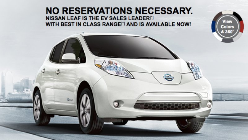
This ad uses fact to display their electric vehicle, the Nissan Leaf. They state that the Leaf is the “EV sales leader” and “best in class range”. The company use bold text and lettering to state their bold facts and use Logos which gives you the relevant evidence and statistics you need to understand what the product is and what it does. This ad doesn’t use any bright or catchy colours as they rely on the head-turning designs of their car combined with the bold text above. Nissan most likely felt that as they are already the “sales leader” they have no need to display their vehicle.

nissan-ad.png

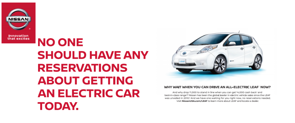
The line “no reservations necessary” is a dig at Tesla as if you want the new Model 3 from them you’ll need to reserve the vehicle way before (similar to a preorder), which clearly isn’t the case with Nissan. They seem to be putting emphasis on the fact that thee is no need to wait to drive the Nissan Leaf, using this as a selling point encourages sales of the car. Nissan has used their trademark Red to emphasise their brand, and blue is commonly used to represent electric vehicles by being used on badges of both fully electric cars and hybrids.

HYUNDAI


yout move elon.png

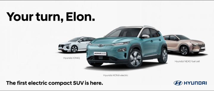
Hyundai also too the opportunity to taunt Tesla’s CEO Elon Musk in a billboard advertisement for their new Electric compact SUV. In the video, I’ve linked below, the company mention that Electric vehicle manufacturers, such as Tesla, are ‘struggling to deliver the future’ due to the high demand for the vehicles. This ad was placed at the exit of the Geneva international airport, before the car’s debut and the Geneva Motor show. The ad uses neutral coloured cars in the background to enhance the blue car in the background and make it pop against the white backdrop. Their 3 Song words are in a bold font/text, which makes it the centre of the viewers’ focus, while the other lettering is less significant.